Fax App for Android & Mac
A fax application taken from whiteboard to polished Android and Mac OS X, with character and icon systems built to win sign-ups in a saturated market.
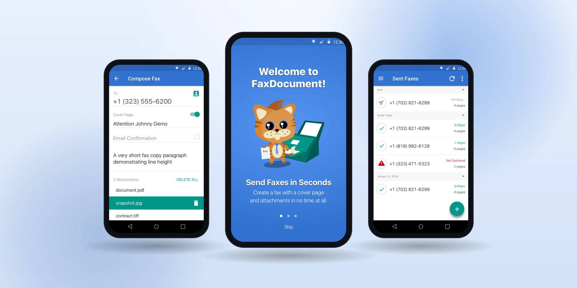
Overview
The fax market was saturated and every competitor did roughly the same job. I kept the feature set deliberately minimal for first-time mobile users, then spent the remaining effort on custom character and icon systems that gave a utilitarian product a personality worth remembering. The app shipped on Android and Mac OS X from one design foundation, and supported the mobile team's later award wins and app growth.
Context & Constraints
The fax market was saturated, and the product needed a simple experience that could generate mobile sign-ups and support retention. I designed both the Android app and the Mac OS X app from the same foundation.
In a category where every competitor does roughly the same job, the open question was what would make anyone choose this one, or remember it.
My Role
I owned UX, UI and character design for the fax app on Android and Mac OS X: whiteboard exploration, personas, use cases, symbol libraries, wireframes and the final visual design for both platforms. The call that made it work was holding the feature set to compose, send, track and refer, then spending everything that saved on a mascot and icon system in a category that treats personality as optional.
I ran the whiteboard sessions with the product and marketing leads through twice-weekly scrums on JIRA, and kept one symbol library feeding both platforms so they shipped as siblings rather than as two apps that happened to share a name.
How I Approached It
I started with whiteboard sessions alongside the product and marketing leads, tracked through twice-weekly scrums on JIRA. I validated the site map and navigation first. Personas linked to simple use cases, and reusable symbol libraries kept both platforms consistent from wireframe onward.
Full-color visual design came last, alongside the character and icon work: the mascot that greets new users and the icon system that carries the product's voice through every screen.
Key Decisions & Trade-offs
The feature set stayed deliberately simple to reduce friction for first-time mobile users: compose, send, track, refer. Everything else was noise between a new user and their first fax.
The other call was investing in character and icon design, in a category where personality is usually treated as optional. The mascot and icon system gave the product a voice competitors didn't have.
Results
The app shipped as complete Android and Mac OS X experiences with custom character and icon systems, and contributed to the mobile team's subsequent award wins and incremental app growth.
Michael is an extreme pleasure to work with. Not only is he an exceptional UX designer, he's a delight to be around. His UX designs have helped our mobile team win various awards since he's been on board. Michael's keen eye for perfection and unwavering passion for branding and design has helped promote incremental mobile app growth. If you need any design change, he'll turn it around before you can shoot him an email with what you need. He sets the bar when it comes to professionalism.
Reflection
In a utility category, personality and extreme simplicity can be more valuable than feature parity. The character system gave the product a voice.