Voice App Onboarding Redesign
A voice app brought up to current iOS and Android standards, with the sign-up funnel rebuilt as its own product. Best UX and Best Productivity Mobile App, 2016.
Overview
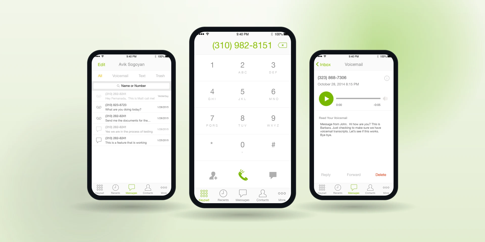
A voice calling app had drifted years behind Apple's and Google's interface guidelines, and it was losing people in the sign-up wizard before they ever placed a call. I rebuilt the funnel as its own experience with its own measure of success: fewer people giving up. Then I modernized the rest of the app around a reusable symbol library. The mobile user base grew, and the app took Best User Experience and Best Productivity Mobile App at the 2016 W3 Awards.
Context & Constraints
Two jobs in one mandate: bring the interface up to platform standards, and stop the bleeding in the native sign-up flow.
Onboarding is where a voice app wins or loses somebody. Every screen between downloading it and making the first call shows up in the growth numbers, and this one had a lot of screens.
My Role
I owned UX and UI for the voice app and for the new sign-up wizard: the guideline review, personas and experience maps, the style guide and iconography, sketches, wireframes and the final visual design. The call that made the difference was treating the sign-up wizard as its own product, with its own measure of success, which was fewer people giving up before their first call.
I worked most closely with the product manager, who pushed to use onboarding to explain the product's value while I argued for taking screens out. Weekly scrums kept the app modernization and the wizard rebuild moving together.
How I Approached It
I opened with a review of the current Apple and Google guidelines, run through weekly scrums, and validated the navigation before anything else moved.
Then I built personas and experience maps, and that is where the sign-up funnel gave itself up. Mapping it screen by screen showed exactly where people were being asked for too much, too early.
A reusable symbol library kept the five rebuilt surfaces consistent across keypad, inbox, voicemail, messages and contacts, five surfaces that had drifted apart over years of separate updates. The sign-up flow went through its own sketches and wireframes into full color, on its own track.
Key Decisions & Trade-offs
Treating the sign-up wizard as its own product rather than a flow bolted onto the app. It got its own experience map, its own screens and its own measure of success: fewer people giving up.
Cutting rather than adding. There was pressure to use onboarding to explain the product's value: more screens, more selling. Every screen that could come out of the funnel came out. The value is the call working, and nobody believes a feature tour anyway.
Results
The mobile user base grew after the shorter funnel shipped, and the redesigned app took Best User Experience and Best Productivity Mobile App in 2016.
Michael is an expert in what he does. He has a good eye for design as well as functionality with regards to user experience. I love bouncing design ideas or questions off of him because he always gives me great feedback. He is well organized, detail-oriented and efficient. Since he joined the team, our mobile apps user base has increased significantly due to the streamlined sign up user experience.
Reflection
Onboarding is usually the highest-value surface in a productivity app, and it is usually the one nobody owns. Making the first few screens effortless paid for itself twice, in growth and in the awards.
What I cannot tell you is how much of the growth was the funnel and how much was the modernization. They shipped together. I would run those separately if I had the chance again.