Mood Tracking for a Mental Wellness App
A 1–10 mood check-in for a mental wellness iOS app, built to take seconds and to leave behind data the product's wellness index could actually use.
Overview
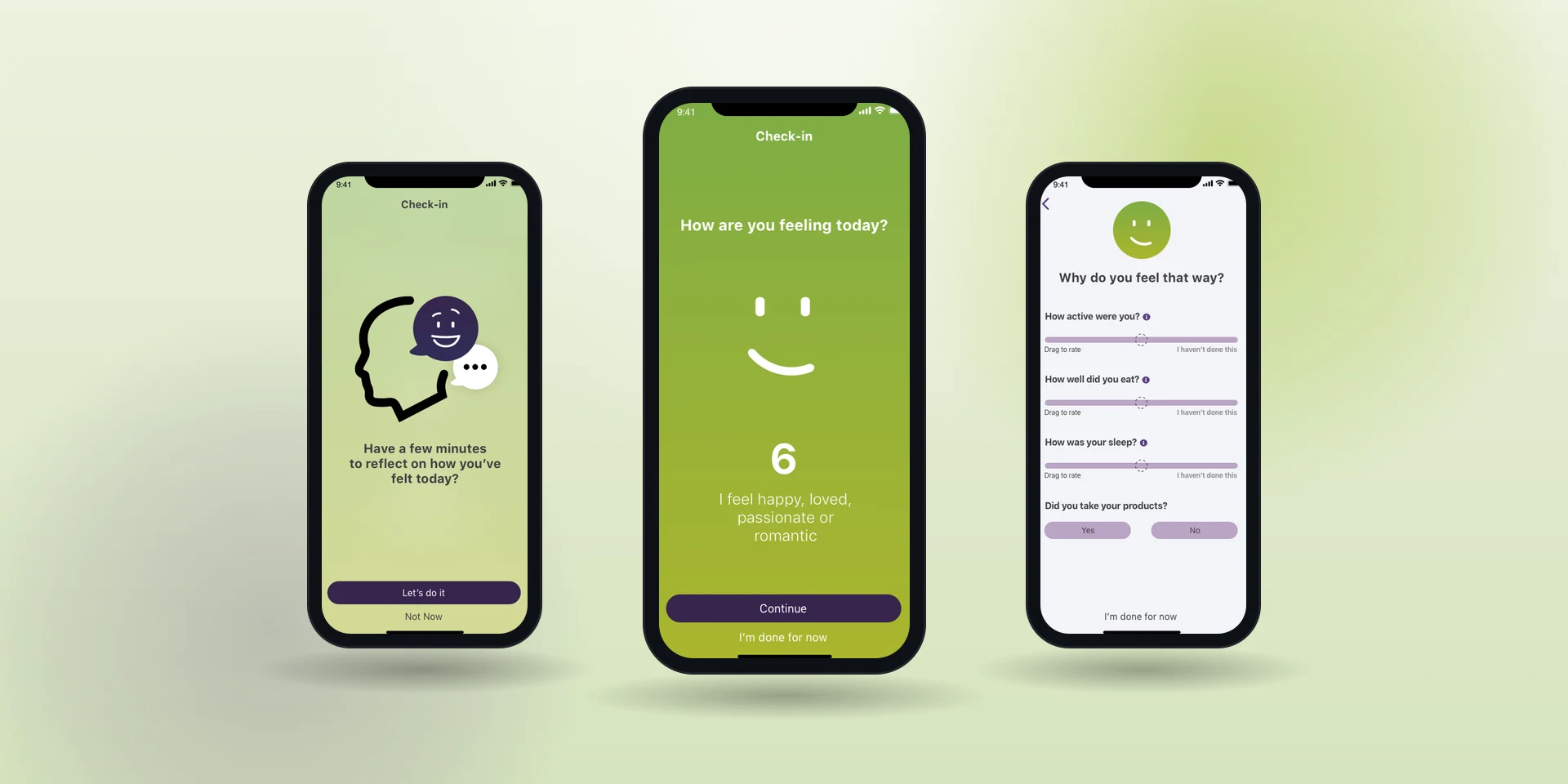
A daily ritual only survives if it costs the user almost nothing. I designed the mood check-in at the center of a mental wellness iOS app: pick a number from 1 to 10 on a color gradient, say why in a structured field, done. It became one of the most-used features in the app and scored 8/10 for usability, and every entry it collected was clean enough to feed the wellness index the product was built around.
Context & Constraints
The wellness app needed to know how people felt, day after day, so patterns could surface over time. That is easy to ask for and hard to earn. Every extra field is a tax on the habit, and a habit that costs thirty seconds is a habit people quit in a week.
Two things were fixed before I started: a first-run instructional overlay, so the scoring model never had to be explained twice, and a color gradient on the scale, so a 3 looked different from an 8 without a word of copy.
My Role
I owned the research and the design for the daily mood check-in, end to end. That ran from discovery workshops, personas and user stories through wireframes, prototypes and usability testing, then out to engineering as high-fidelity specs. What made the check-in survive as a daily habit was keeping it to one number and one short answer.
I whiteboarded the check-in around one sentence: reflect on today, score it, say why, move on. Anything that did not serve that sentence had to justify itself.
How I Approached It
Discovery first: workshops, interviews, focus groups, surveys, personas. All of it pointed the same direction. People will tell you how they feel, but only if you ask fast.
I built the wireframes in Sketch, linked them into InVision prototypes and ran the check-in sequence through usability tests on UserTesting.com. The global design system carried the visual layer, so the work went into the interaction rather than the styling. Delivery was annotated Zeplin assets and Azure DevOps stories.
The small moments mattered more than they look like they should. Nobody sets out to track their mood, which is part of why so many people struggle with it, so the check-in had to feel quick and quietly worth doing rather than like homework. A notification opened it, a few short taps named what was driving the score, and anything longer stayed optional or could wait until later in the day.
The entries did the rest of the work on the back end. Each one tied to the ones before it, so a pattern surfaced out of a week of five-second check-ins without anyone being asked to keep a journal.
A daily mental-health check-in can read as clinical very easily, and clinical is not a thing anyone opens voluntarily on a bad Tuesday.
Key Decisions & Trade-offs
A 1–10 scale with a color gradient, instead of a multi-axis mood model. The richer model measures more. The simple one gets used every day, and daily use was the entire product.
Free-text fields stayed deliberately narrow. That was the uncomfortable one: I was constraining what someone could say about their own feelings so the entry would still be computable later. It is the right call for an index that has to chart, and it is a real cost to the person typing.
The instructional overlay ran on first use rather than living behind a help menu. If the scoring model needs explaining twice, the scale is wrong.
Results
The check-in saw wide adoption and directly enabled the product's mental wellness index. Every day of check-ins became chartable, pattern-ready data. Usability testing produced an 8/10 score, and users described the tracker as useful and fun in follow-up interviews.
Michael is an excellent addition to any team! He is not only an amazing product designer, he also incorporates user perspective through interviews, research and pure knowledge. He adds value by contributing with a mindset of a product owner and puts effort to make sure the product will succeed in all phases from planning to go-live. We have worked together in six different projects that started from the ideation phase and include mobile, widgets and web. In all projects Michael has been fundamental to the team!
Reflection
Picking a number from 1 to 10 turned out to be the most valuable thing in the product. That still surprises me slightly, and it probably should not.
What I would check now is the cost of the constraint. I know the structured fields made the data usable. I never measured what people wanted to say and could not, and on a wellness product that is not a small unknown.