Windows 10 Faxing App
The Windows 10 desktop faxing application, from discovery through high-fidelity hand-off. The modernized experience contributed to 400% year-over-year growth.
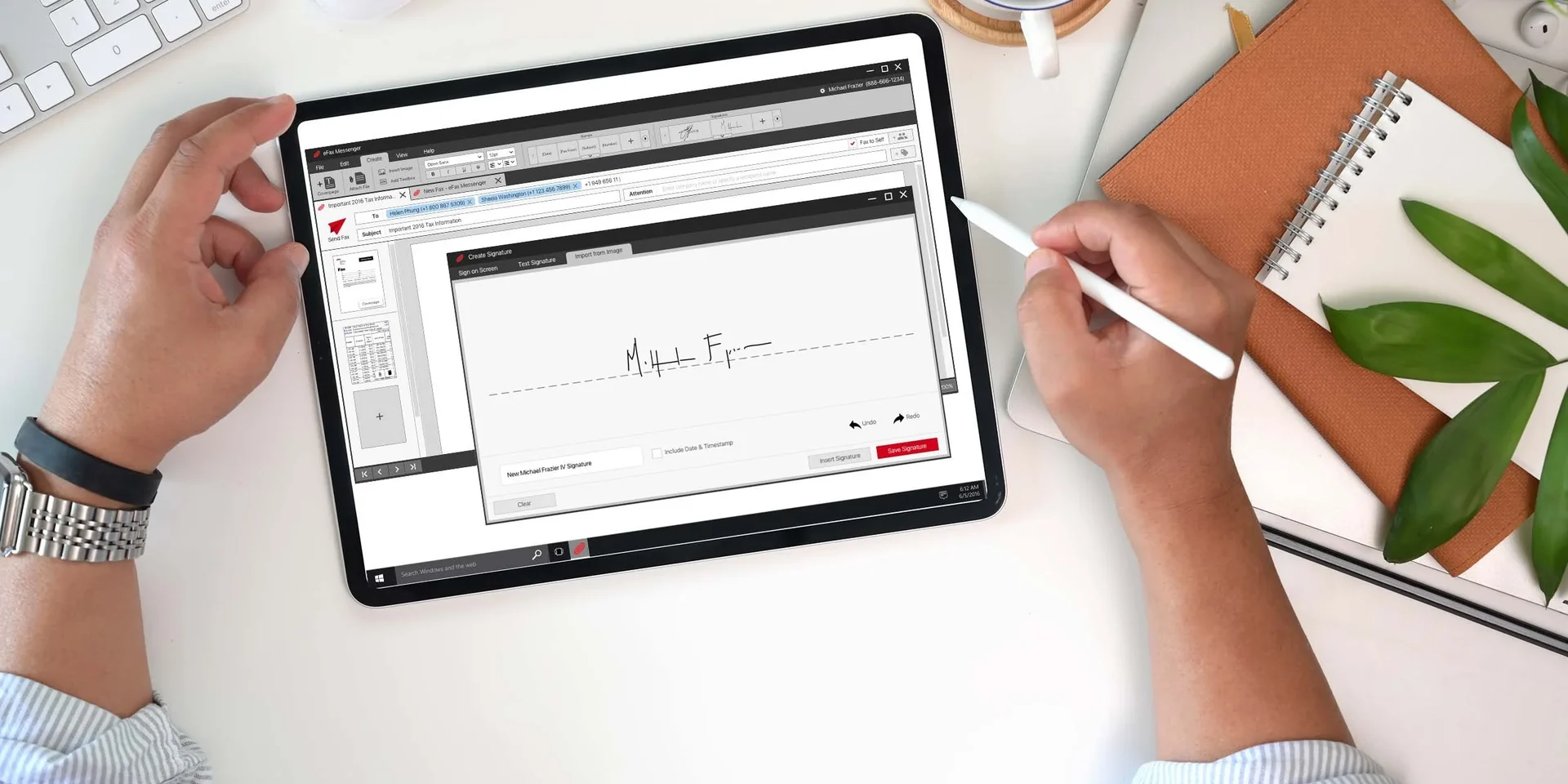
Overview
Faxing is still legally load-bearing in plenty of industries, and the incumbent Windows experience felt a decade old. I scoped the release tightly to the four flows corporate users actually needed: compose, view, stamp and signature. Then I iterated with resellers in an agile loop rather than chasing legacy feature parity. The version-1 beta scored 8/10 with corporate users, and the modernized product helped drive 400% year-over-year growth in the brand's user base.
Context & Constraints
Existing and new corporate customers needed a native Windows 10 faxing tool. Faxing remains legally load-bearing in plenty of industries, and the incumbent experience felt a decade old. The scope had to stay focused on MVP functionality while still feeling current enough to represent the brand.
The audience for the app split two ways: existing customers who knew the legacy product's every corner, and new corporate users who would judge the app entirely by its first ten minutes.
My Role
I owned end-to-end UX and UI for the Windows 10 faxing app. The work ran from stakeholder and user interviews through a discovery workshop, card sorting, wireframes, high-fidelity mock-ups and InVision prototypes, then out to development through Zeplin and JIRA. I worked most closely with the product manager and with the resellers who saw every build. What made the release land was scoping it to the four flows corporate users actually reached for, and putting the beta into reseller hands early enough that their feedback still shaped it.
How I Approached It
Interviews with users and stakeholders established the jobs-to-be-done, and a discovery workshop turned them into priorities through whiteboarding and open argument. User stories and card sorting shaped the information architecture before a single screen was drawn.
Wireframes iterated until the MVP layout was approved, then I moved to high-fidelity mock-ups and basic InVision prototypes before development hand-off. Resellers saw the designs continuously, not at the end. Their feedback loop was part of the process, not a gate after it.
Key Decisions & Trade-offs
The first release stayed tightly scoped to core compose, view, stamp and signature flows rather than trying to match every legacy feature. A modern app that did four things confidently beat a familiar one that did fifty things adequately.
Putting the beta in reseller hands early was the second bet, prioritizing an agile feedback loop over perfect polish on day one. Shipping the beta into real reseller hands early bought trust that no amount of internal refinement could.
Results
The modernized interface contributed to 400% year-over-year growth in the brand's user base, driven by higher customer satisfaction. Reseller confidence increased through the feedback loop, and the version-1 beta scored 8/10 with corporate users.
When it comes to user experience and user interface design, Michael is an expert. As a Product Manager, I had the pleasure to work with him on a large redesign project, which was an educational and fun experience. Michael is always open to new ideas and proactive when it comes to my design change requests. He's an innovative thinker, with a deep understanding of the latest and greatest design standards. Michael is a smart, attentive listener who will execute your product vision exactly the way you want.
Reflection
Tight MVP scoping plus continuous reseller input produced both speed and trust. The 400% was a team outcome, but the design decisions made the product feel current enough for that growth to stick.