White-Label Mobile Banking App
One codebase, dozens of banks that each look and behave like themselves. Theming and feature configuration moved client app-store ratings from 2.0 to 4.9.
Overview
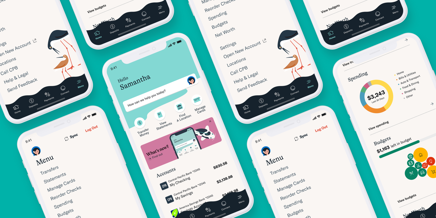
A white-label banking platform serves millions of members across dozens of institutions, and every one of them wants an app that feels like theirs. I made configurability the product rather than a settings page. Each institution's own designers drove its theme and feature toggles let it run its own roadmap on shared code, while custom success moments kept the common experience from feeling generic. That work also rebuilt the transfers funnel around trustworthy data and shipped 15+ new or redesigned features. Client app-store ratings moved from 2.0 to 4.9 stars, and institutions reported deposit growth of up to 37×.
Context & Constraints
The product is a white-label mobile banking platform used by millions of members across dozens of financial institutions. Every client selects which features to turn on and dresses the result in its own brand. The same screen ships as a Hawaiian credit union, a regional bank and a national institution in the same release, and it has to feel native and trustworthy as all three.
Shipping one codebase as dozens of distinct banks is the hard part of white-label work. Configuration is not a settings page bolted to the side of a product. It is the product. Anything designed for one client either generalizes to every other client or becomes a fork somebody maintains forever.
I worked under the usual constraints of regulated fintech: tight security requirements and an existing codebase that limited some interactions. Clients also needed to see clear business value before approving larger design changes, which meant lower call volume, higher digital account openings and cleaner transfers.
My Role
I owned the design of the platform's configuration model: the theming axes each institution could move along, the contact-and-connect experience, the digital account-opening surfaces and the transfers funnel. The call that made all of it supportable was drawing the configuration line at flow shape, so brand, feature set and voice could change while the order of steps in a transfer could not.
I ran walk-the-store workshops with internal stakeholders and the Hawaii credit union team, then sat with engineers to map the codebase against what those sessions surfaced. I worked most closely with the group product manager, and mentored the designers on the team.
How I Approached It
Theming set the terms for everything else. I ran branding workshops with the credit union's own designers, and the goal was explicitly not a generic skin with a color swapped. Together we built custom success graphics, micro-moments and "experience candy" that made the app feel uniquely theirs while still living inside the shared white-label system. Every one of those moments had to be expressible as configuration rather than a one-off, or it could not ship.
Configurability meant designing the axes a client could actually move along: brand color and typography, iconography and illustration, which features appear at all and where a client's own voice replaces the platform's default copy. It also meant being deliberate about the axes they could not move, so no configuration could produce a version of the app that was confusing or untrustworthy.
I started from walk-the-store workshops alongside both internal stakeholders and the client team. Walking through the live app together made the gaps obvious. Members abandoned transfers because the data felt incomplete or unclear. They couldn't resolve simple questions without calling support, and the marketing surfaces never guided them toward fully digital account opening.
I sat with engineers to map the codebase against the pain points those sessions surfaced, and we picked three areas we could improve without a rewrite. The first was a contact-and-connect experience that answered common questions inside the app and cut call-center volume. The second pushed marketing and onboarding surfaces toward full digital account opening. The third rebuilt the transfers funnel with more accurate balances and rates, plus loan and credit payments in the same flow.
Key Decisions & Trade-offs
The clearest trade-off was how far to let clients configure. Institutions wanted their app to be theirs, and every bespoke request was easy to say yes to individually and impossible to maintain collectively. I drew the line at anything that changed the shape of a flow. Brand, feature set and voice were configurable. The order of steps in a transfer was not. That kept dozens of visually distinct apps behaving identically underneath, which is what made them all supportable.
One of the clearer product trade-offs came in rebuilding the transfers funnel. We could have kept the existing funnel and only cleaned up the UI, but the data accuracy issues were driving support tickets. I pushed for deeper backend alignment so the most important numbers always felt trustworthy, even if that meant a longer engineering cycle.
On the contact-and-connect experience I deliberately kept the first version focused on the highest-volume call reasons rather than trying to solve every support scenario at once. That let us ship faster and prove the call-volume reduction before expanding.
Results
Across the platform, continuous iteration and feature work moved average client app-store ratings from 2.0 to 4.5 and above, with the flagship client reaching 4.9. Institutions could stand up a genuinely branded app on shared code instead of negotiating for a fork. The Hawaii credit union's experience improved markedly once its own theme, the new contact flows, clearer transfers and stronger digital account-opening paths were live. The design team's work helped raise the overall product UEQ-S score from average to excellent.
Michael is an excellent addition to any team! He is not only an amazing product designer, he also incorporates user perspective through interviews, research and pure knowledge. He adds value by contributing with a mindset of a product owner and puts effort to make sure the product will succeed in all phases from planning to go-live. We have worked together in six different projects that started from the ideation phase and include mobile, widgets and web. In all projects Michael has been fundamental to the team!
Reflection
Looking back, the walk-the-store sessions with the client were the highest-value discovery activity. Seeing the friction together removed a lot of abstract debate later. If I ran a similar engagement today I would involve engineering even earlier in the branding workshops, so the custom success moments could be scoped as configuration from the first sketch rather than reverse-engineered afterward.