RadAI: AI Radiology Application
One of the first on-canvas generative AI reporting tools for radiologists. Report quality up 60%, time to report cut in half.
Overview
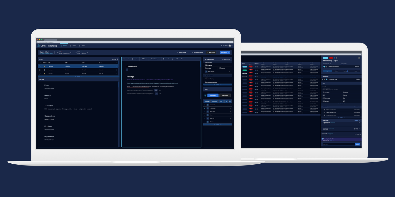
Radiologists are reading more scans than ever with fewer people to read them. RadAI was built by and for radiologists to take some of that weight: one of the first on-canvas generative AI reporting experiences, where recommendations and comparisons sit in the reading canvas instead of a side panel nobody opens. I designed it across three product teams and pulled them onto a single design system with light and dark modes. Report quality improved 60% and time-to-report was cut in half, measured through Duke University's impression-evaluation program.
Context & Constraints
I joined as a contract product design lead, embedded across three separate product teams: Continuity, Nexus and Reporting. Each had grown its own design system, its own interaction patterns, its own technical constraints. Three products, one company, three visual languages.
Radiologists work in conditions most software never accounts for. Hospital reading rooms, monitors of every size, lighting that demands high contrast and specialized hardware down to handheld clickers. RadAI had to hold enormous amounts of clinical data on screen and stay scannable in all of it.
AI-assisted reporting pipeline
- Scan Intake
- AI Draft Findings
- Radiologist Review
- Care Journey
- Report Out
My Role
I owned the interface design for RadAI across its three product teams, Continuity, Nexus and Reporting, and the shared design system that finally let them work as one. The call that made it work was keeping the AI's draft findings and prior-scan comparisons on the reading canvas instead of exiling them to a side panel, then paying for the extra density with hierarchy and contrast.
I joined as a contract design lead and sat inside all three teams. I partnered with the product manager through discovery and walked real hospital reading rooms rather than working from personas. From there I took the diagnostic requirements from clinical stakeholders into interfaces a radiologist could read at speed.
How I Approached It
The product manager and I started with walk-the-store sessions built around a real radiologist's day. We mapped the journeys inside actual hospital and reading-room setups, watching where comparison broke down and where findings got lost.
Standing in a real reading room made the pain points obvious. Fragmented visual languages made switching between tools expensive. High-contrast needs were handled inconsistently. And the early AI output sat buried below the fold rather than in the canvas where the reading happens.
So I ran lightweight experiments on the two things we were least sure of: whether radiologists would accept an AI recommendation at all, and how much density they could actually scan under real lighting and real hardware.
From there I designed for scannability and side-by-side comparison as non-negotiables, and introduced a shared design system with light and dark modes, still uncommon in clinical tools in 2024. That system became the bridge between three teams that had never shared one.
Key Decisions & Trade-offs
The biggest early call was to stop treating the three teams as three design problems. One coherent system cost more alignment up front and removed the context-switching tax for radiologists, and for the designers and engineers too.
On the canvas we kept recommendations and comparisons tightly integrated instead of exiling them to a side panel. That raised visual density, so we spent real cycles on hierarchy, progressive disclosure and contrast to protect scannability. Density is only a problem if the eye cannot find the entry point.
We shipped the highest-volume clinical workflows first rather than trying to cover every before, during and after care scenario in the first release.
Results
The platform delivered a 60% improvement in radiologist report quality, with time-to-report cut in half. Clinical stakeholders, including leadership at Duke, specifically called out the clarity of the complex workflows. The shared design system with light and dark modes gave the three product teams a common language for the first time and made future feature work significantly faster to design and implement.
This is at the forefront of LCS (Lung Cancer Screening) programs. Your user experience and interface design is amazing. Very nice job. By streamlining the process and providing radiologists all these tools we have seen an improvement of 60% impression evaluation and recommendations to next steps which will help diagnose cases and save lives.
Reflection
Fragmented design systems are expensive everywhere. In a high-stakes environment they are dangerous, because the cost is paid in attention by someone reading a scan.
The walk-the-store sessions were the thing. Abstract personas would never have surfaced the hardware and the lighting, and those two constraints shaped the final interface more than any workshop did.
Starting again, I would bring clinical radiologists into the design-system workshops earlier, so the light and dark decisions were validated against real reading-room conditions from day one instead of confirmed later.